A few months ago, assets in US equity index funds surpassed assets in traditional active funds. Globally, including exchange-traded funds (ETFs), assets under passive management have now climbed above the $11tn mark, according to the Financial Times. In terms of fund flows, the change has been even more dramatic. Massive inflows into index funds have been financed by large redemptions at active fund management companies, at least in the US.
Couldn't care less?
Please do. In a sense, it's all about the price tag. In grocery stores, higher prices lead to lower volumes sold. In the stock market, it's not that straightforward. If you manage an index fund, you make no assessment whatsoever of the individual stocks and their prices. You just buy a given basket of stocks, weighted according to the reverse price tag principle – in the stock market, higher pricing translates into higher market values, i.e. higher index weights (unless of course other stocks appreciate even more).
There is a lot to be said for index funds, not least cost efficiencies. But if enough investors choose passive investment vehicles, who'll be bothered with making sure that price tags are not blown out of proportion?
The Swedish business daily Dagens Industri recently pointed out that Apple and Atlas Copco had a correlation last year of 97 per cent (!). A bit of cheating there, as correlating prices for high-beta stocks is bound to reflect their exposure to the same underlying trends and cyclicality. But do feel free to raise an eyebrow – there are some interesting forces at work here.
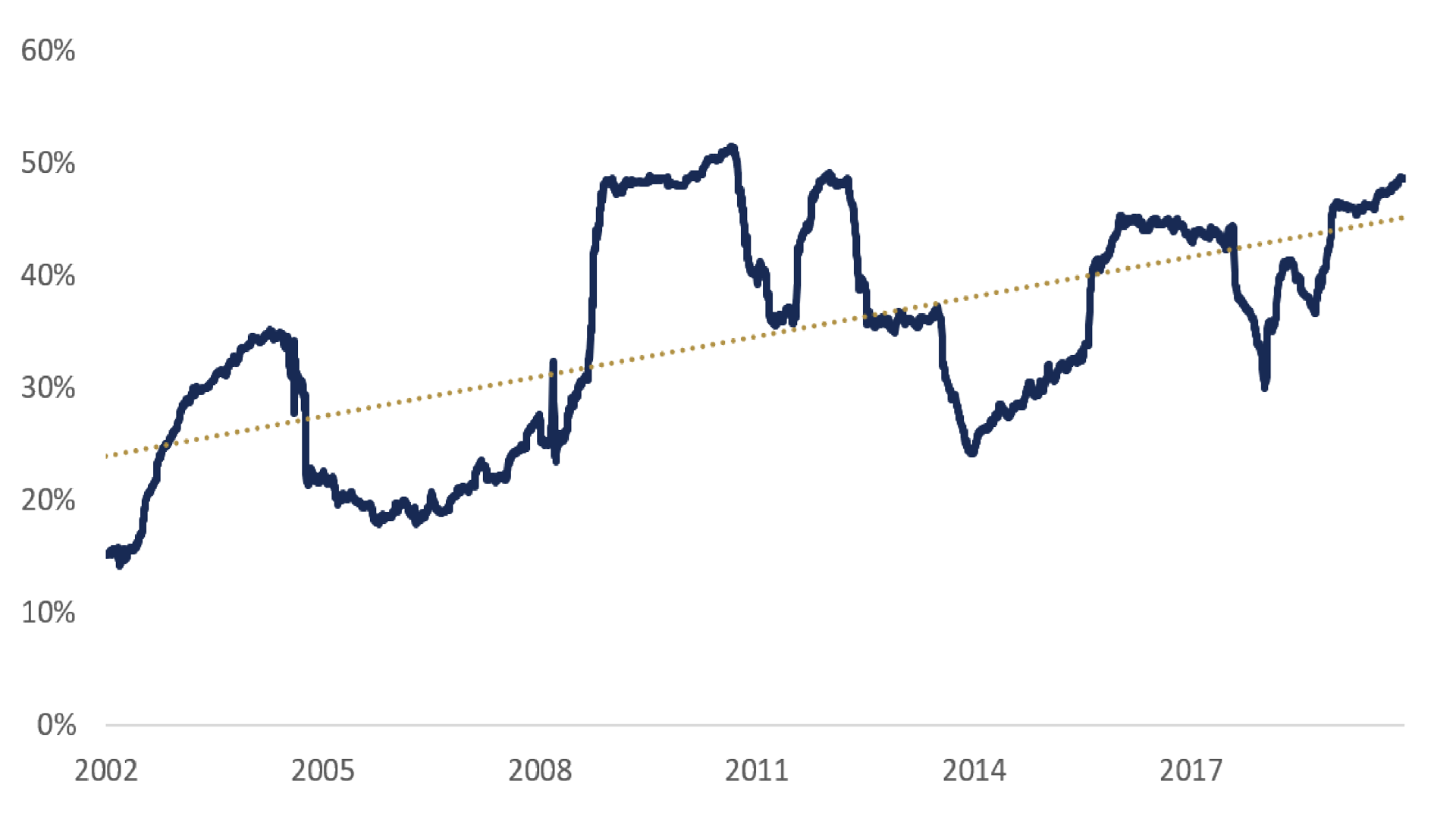
A more appropriate measure would be correlating returns, not prices. So, out of curiosity, I downloaded daily returns for the current top 10 stocks in the S&P 500, the top 10 stocks ten years ago and the 10 largest stocks back then which are no longer part of the index but still listed. On average, the top 10 make up about 1/5 of the total market cap and their share has been rising.
Tango, anyone? Everyone?

Well, would you know: The average correlation of today's index giants has been going up in leaps and bounds since the start of the millennium, rising from some 15 per cent in 2002 to almost 50 per cent over the past two years.
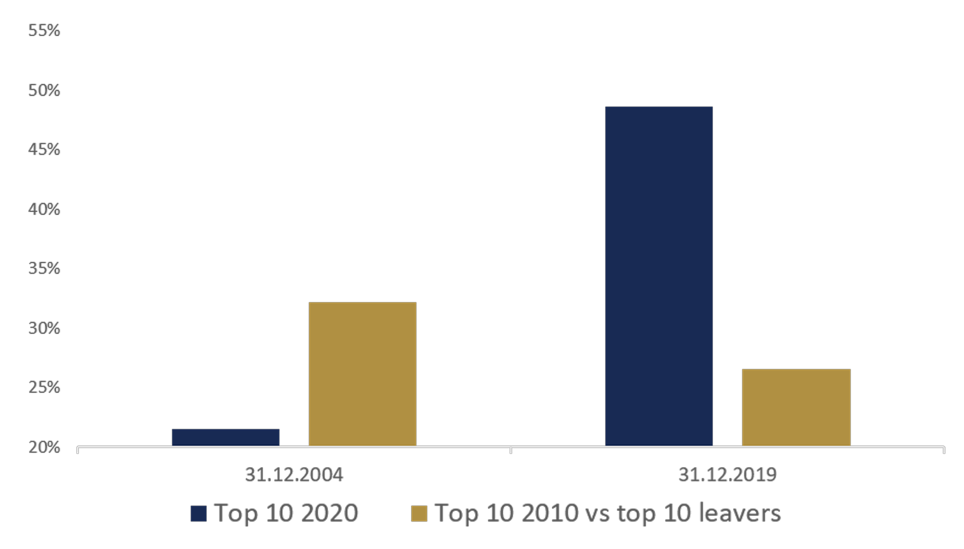
In contrast, the correlation between the top 10 stocks at the end of 2009 and the top 10 leavers – companies that are no longer part of the index – has been falling. They don't move in tandem anymore.
Pulling the leavers

It's fairly well established in financial research that betas tend to go up when stocks are included in an index and vice versa. A similar pattern might be expected for individual correlations, but it doesn't necessarily follow. During the second half of the last century, correlations were generally falling, perhaps due to individual stocks being better researched. In the mid 1990s, however, it seems the trend shifted.
Why? Most likely because increasing inflows into index funds and other passive investment vehicles are being invested in index companies in proportion to their respective index weights. To the extent that net demand is being determined by index investors, these stocks are simply riding the same currents – amplified, perhaps, by algorithm trading.
No wonder indices have tended to fall more sharply than comparable stocks outside of the indices when the stock market crashes.
“It’s silly to invest more only because something did well in the past.”

