Biased by construction
The Optimal Pareto
25.09.2026
The most widely used charts in the fund management business compound our cognitive recency bias. But you knew this, of course.
The most widely used charts in the fund management business compound our cognitive recency bias. But you knew this, of course.
Have you ever stopped and wondered how much weight we assign to recent returns in compound return charts? I’m sure you’ve seen plenty of charts with annualised returns over 1, 3, 5, and 10 years, with or without related benchmark returns. These charts are part and parcel of the fund management business.
Mathematically, such charts have a distinct recency bias – compounding our innate tendency towards the same. Due to a cognitive bias, we attach much more importance to recent events. And with standard compound charts, we reinforce this bias.
If you think this sounds incredibly banal, I venture it’s not obvious until you actually stop and think about it. Imagine a chart with four columns, showing returns over 1, 3, 5, and 10 years. The last year represents the entire first column, one third of the column showing 3-year returns, and so on.
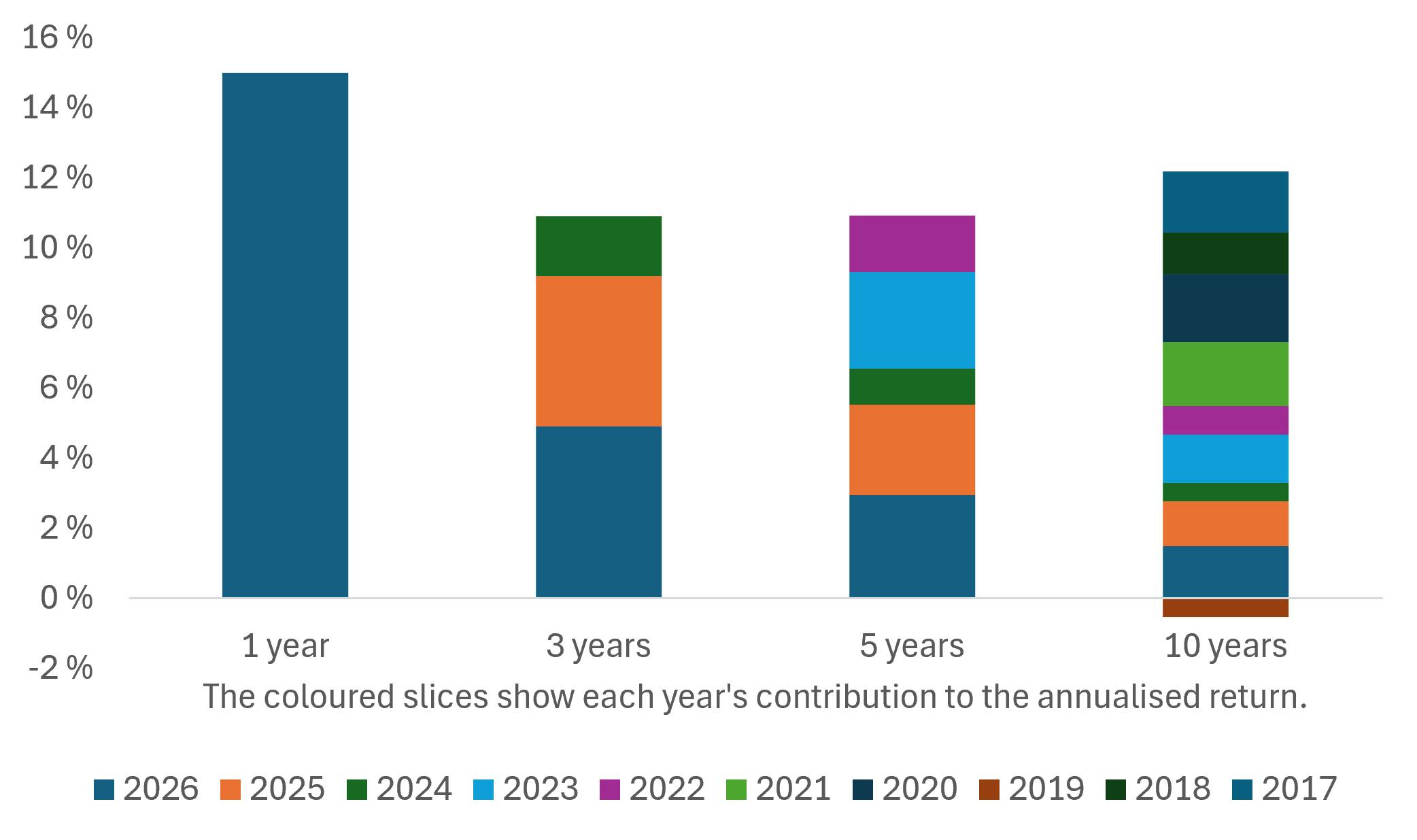
Provided returns are constant, the very last year represents more than 40% of the contributions to this chart. The return 10 years ago will constitute only 2.5%. To the extent that all the past 10 years are considered representative of the style and quality of the management process, we significantly overweight the very recent outcomes.
One way of overcoming this bias may be to pull random samples of annual returns over the same number of years, in effect using your actual fund history to simulate returns. If you do consider all years equally representative, this will ensure all years are given the same weight – provided, of course, a sufficient number of simulations.
The easiest fix, though, or rather band-aid, is simply to be aware of it. Be honest now: Did this strike you the first time you saw such charts – or even the last time?

Finn Øystein Bergh joined Pareto in 2010, the first years in Pareto AS before joining Pareto Asset Management in 2015. He has previous experience as a journalist, chief economist and later managing editor in the financial magazine Kapital. Finn Øystein Bergh holds an MSc in Economics and Business Administration, MBA, cand. polit. (an extended master's degree) in political science and cand.polit. in economics. He writes the financial blog Paretos optimale, and has published several books on economics.